Skincare Label Design: What to Avoid
In the skincare world, you have exactly 3 seconds to make a first impression. That’s how long potential customers spend scanning your product before deciding whether to pick it up or keep walking. Your skincare label design isn’t just packaging – it’s your brand’s first handshake with every customer.
The Brutal Truth About First Impressions
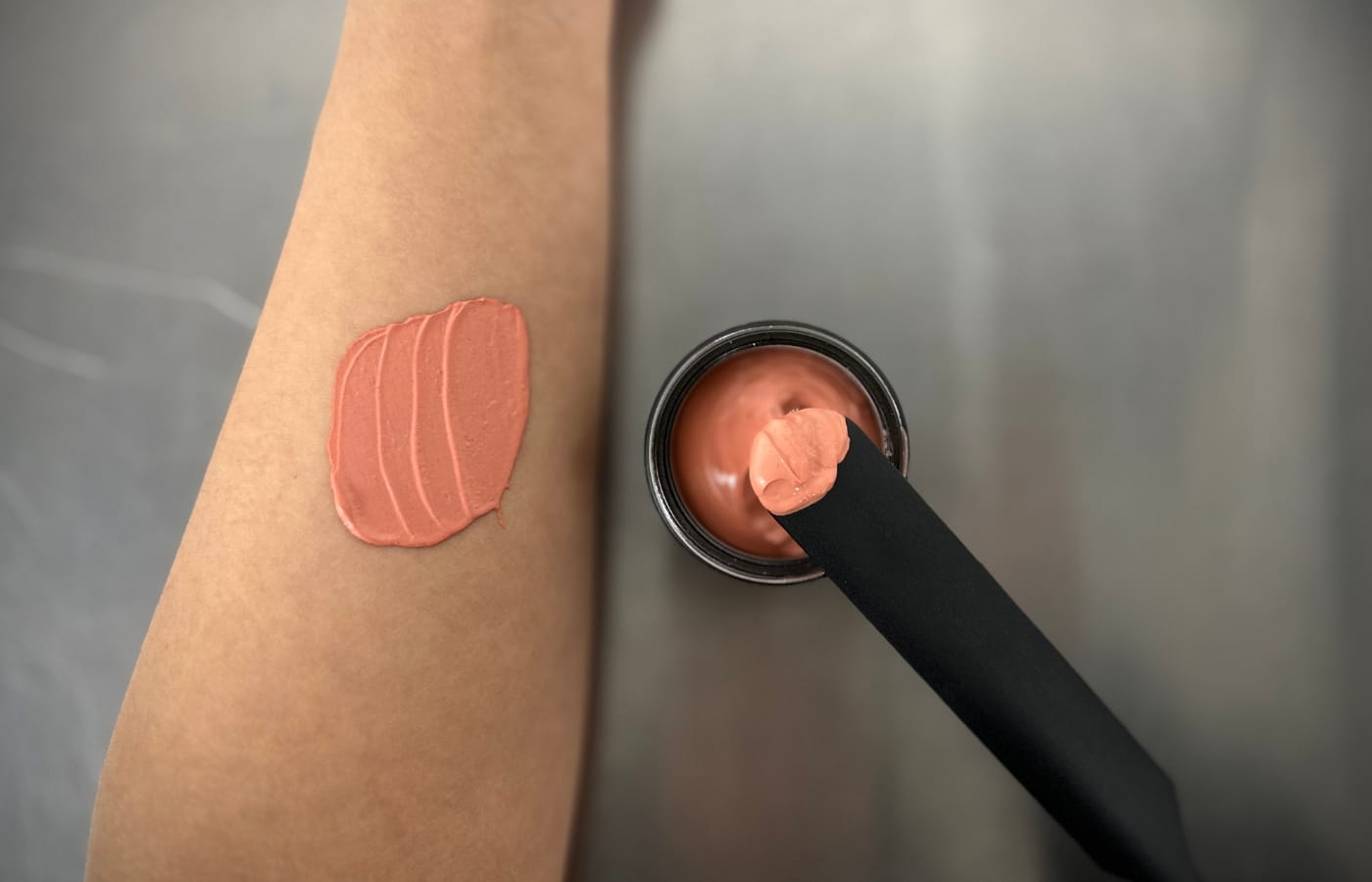
We’ve launched hundreds of private label skincare products, and here’s what we’ve learned: amazing formulations mean nothing if your label design screams “amateur hour.” Customers make instant judgments about product quality, brand credibility, and whether they trust putting your product on their skin – all based on your label.
The skincare market is incredibly competitive, and professional label design is what separates successful brands from those that get lost on crowded shelves. It’s not about being the flashiest – it’s about being the most trustworthy and appealing to your target customer.
Label Design Mistakes That Kill Sales
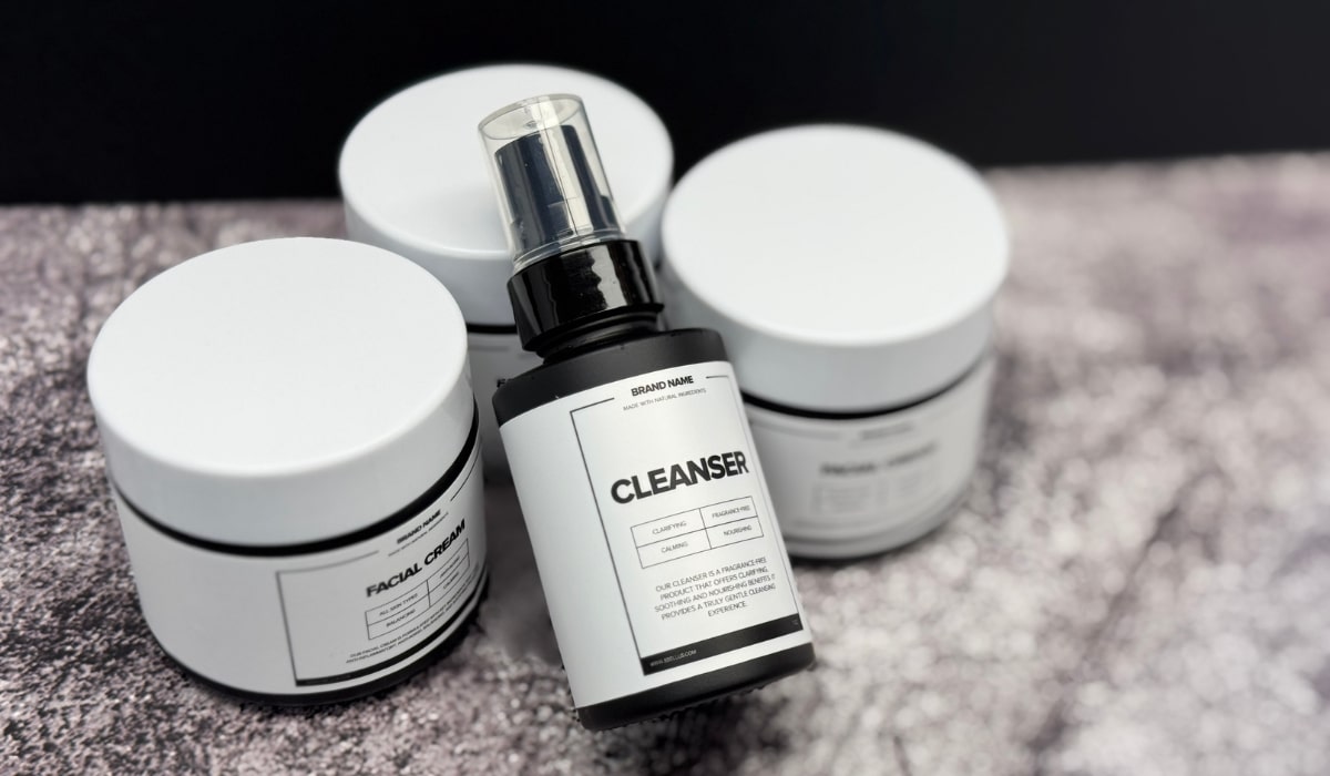
Let’s talk about the label design disasters we see constantly. First up: trying to cram every possible benefit onto your label. We get it – you’re excited about your amazing formula. But labels covered in tiny text about 15 different benefits look desperate and unprofessional.
Another killer mistake? Using generic stock photos or clip art. Nothing says “cheap knockoff” like a label with obviously fake lifestyle imagery. Your customers can spot stock photos from across the store, and it immediately undermines their confidence in your brand.
Color choices can make or break your cosmetic branding too. We’ve seen beautiful formulations fail because the label colors were either too garish (screaming “discount bin”) or so muted they disappeared on shelves. Your colors need to attract attention while conveying the right brand personality.
Typography Disasters We See Everywhere
Font choices reveal everything about your brand’s professionalism. Using multiple fonts, choosing fonts that are hard to read, or picking fonts that don’t match your brand personality can instantly cheapen your entire product line.
We constantly see private label skincare brands using fonts that look like they were designed for children’s products when they’re targeting sophisticated adults, or vice versa. Your typography should reinforce your brand positioning, not contradict it.
The Information Overload Problem
Here’s a big one: trying to be everything to everyone on your label. We see labels that promise anti-aging, acne-fighting, brightening, hydrating, and firming benefits all in one product. This approach makes customers skeptical rather than excited.
Focus on your product’s main benefit and communicate it clearly. If your serum is primarily for hydration, lead with that. Don’t muddy the waters by trying to claim it also fights wrinkles, reduces dark spots, and prevents breakouts.
Regulatory Compliance Isn’t Optional
We’ve seen gorgeous label designs that had to be completely redone because they didn’t meet FDA requirements. Claims that can’t be substantiated, missing required information, or incorrect ingredient listings can shut down your entire launch.
This is where working with experienced cosmetic branding professionals becomes crucial. We ensure every label meets regulatory requirements while still looking stunning and market-ready.
Getting It Right From the Start
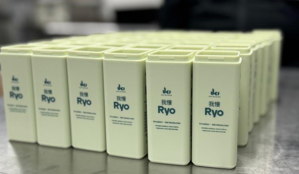
The best time to invest in professional label design is before you launch, not after you realize your DIY labels aren’t working. We’ve helped countless private label skincare brands transform their market performance simply by upgrading their packaging design.
Remember, your label design is working 24/7 to sell your products. It’s your silent salesperson, your brand ambassador, and your quality promise all rolled into one. Make sure it’s representing your brand the way you want to be seen.
Ready to create label designs that make customers reach for your products first? Let’s talk about packaging that converts browsers into buyers.